The answer is in the archives of Piazza Mignanelli, the Roman headquarters of the Valentino maison
Here Pierpaolo Piccoli, creative director of the Maison, has created a real working methodology. A process of focusing and research, of analysis and construction.
A concrete example is the recent Escape 2022 collection, which incorporates the Round Rain prints (1966), the multicolor Valentino Waves (1970) and the Giraffa re-edition (1966), materializing the imagination of a summer escape with a strong personality graphics and a latent sense of hedonism.
The volume proposes a journey through over 550 red palettes in haute couture creations and, paradoxically, manages to make the common denominator red a background capable of putting the maison’s master craftsman in the foreground.
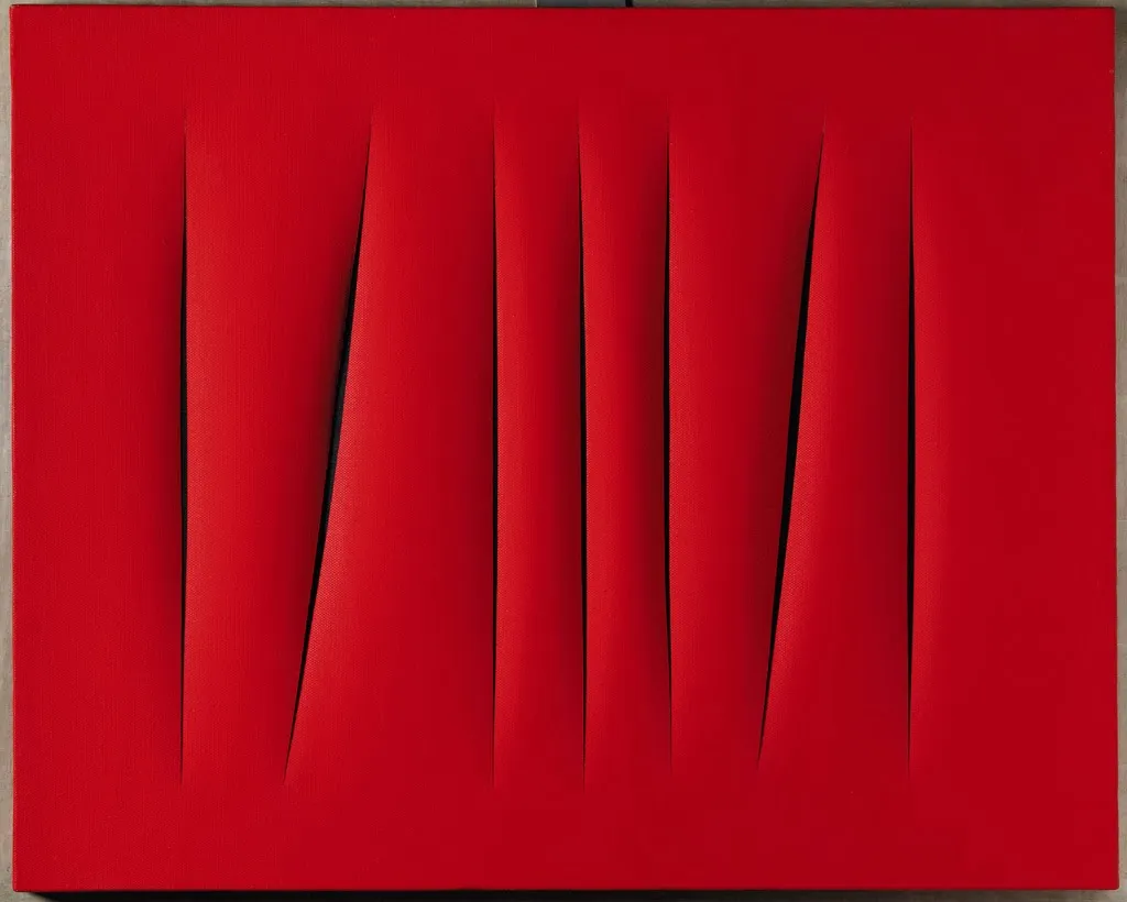
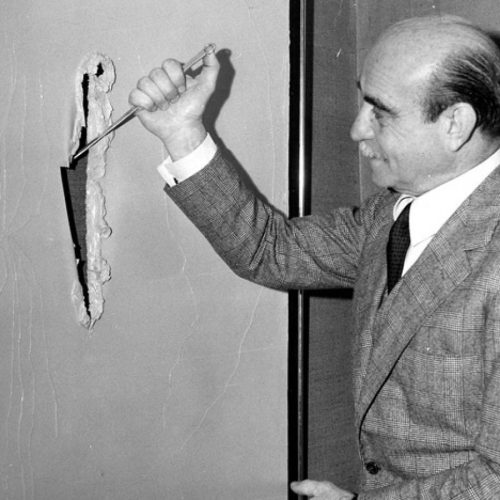
Pierpaolo Piccoli said he found inspiration in the work of the artist Lucio Fontana, on the theme of monochrome.
Fontana is the author of the famous monochromatic canvases on which he made cuts.
Canvases with which he proposed a new concept of space. For Fontana, the canvas is no longer a surface on which the picture is painted, but is itself an element in space.
The cut ensures that this surface is no longer flat, produces a shift of light and creates the illusion of an infinite space behind the canvas.
Piccoli had already shown his interest in monochrome in the FW22 / 23 collection with the #PinkPP. Here the use of a single color had created a real short circuit in the perception of those who observed the show, the environment and pink clothes allowed the eye to observe with dedicated attention the cuts, structures and fabrics of the clothes. To go beyond appearance, looking for authenticity
isn’t this the heritage?